For inspiration, I reviewed other chocolate packaging and visited chocolate companies' websites to get a better idea of what the chocolate industry looks like.
I explored different illustration ideas and packaging in my sketches.
As part of the package redesign, I rebranded Choceur, giving the company a simplified yet elegant wordmark.
The logo may be used in black, white, blue, or blue foil. I also determined the clear space for the logo.
These art elements allude form of the cocoa beans. The burst celebrates the chocolate and hints at the growth of the company. Number 1. is exclusively used above and below the wordmark. Number 2. is a secondary burst, placed around taglines and subheadings. Number 3. is used on the chocolate pieces.
The typography is easy-to-read and feels modern, supporting the cleanness and elegance of the brand. In response, the colors add a sense of cheerfulness, and each corresponds with one of the classic flavors.

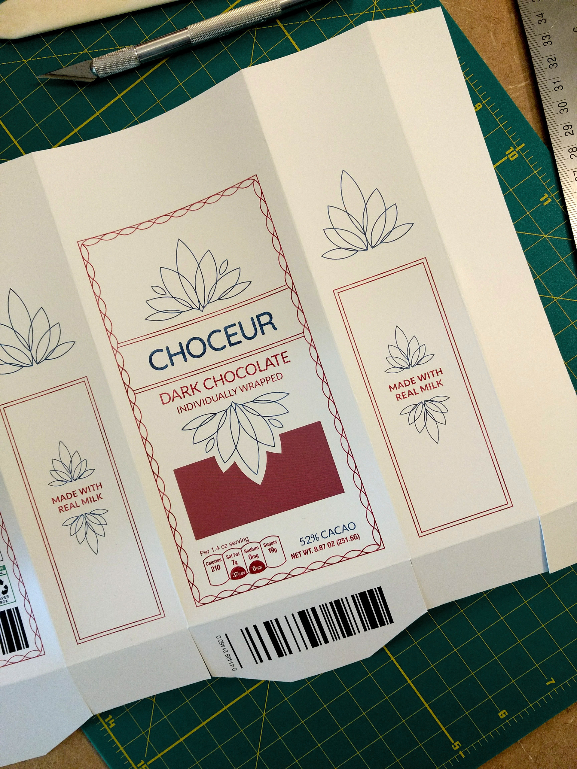
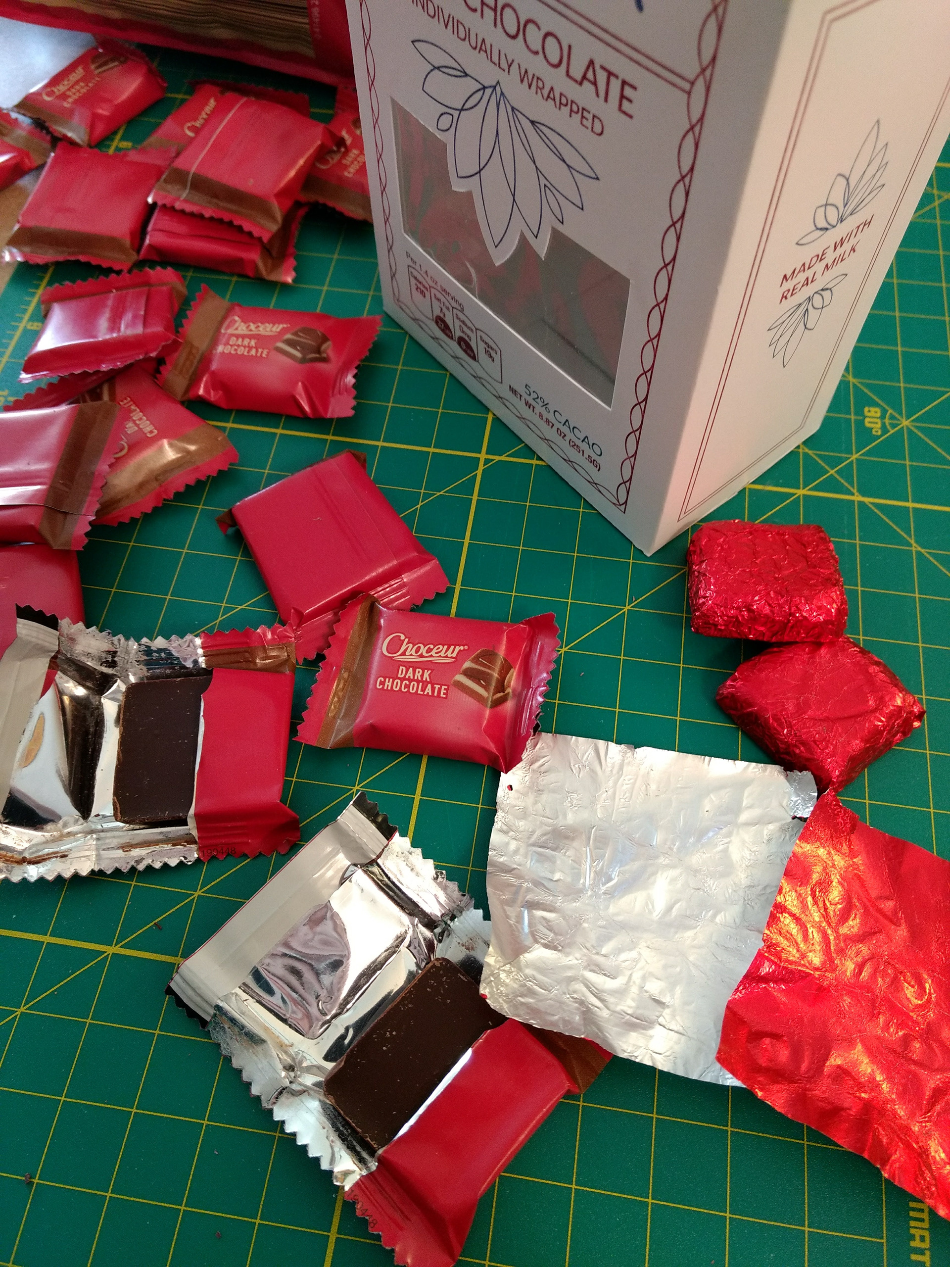
The foil-wrapped chocolates reinforce the sophisticated and elegant style of the brand and box.
I rewrote the description based on the original and included the nutrition facts and logos.
Choceur doesn’t have a website, so I designed what it would look like. I used primarily black and white to give the website a sophisticated look and help the chocolate stand out.
Choceur announces their rebrand on social media as well, updating their cover pages on Facebook and Twitter to reveal their new look.
On Instagram, I created a cohesive set of posts, extending their rebrand campaign and designing a precedent for future posts.
